🏗️
MauiReactor
  • What is MauiReactor?
  • What's new in Version 2
  • What's new in Version 3
  • Getting Started
  • Getting Started Version 2
  • Components
    • State-less Components
    • Stateful Components
      • Inline Components
    • Component life-cycle
    • Component Properties
    • Component with children
    • Component Parameters
    • Theming
    • Navigation
      • NavigationPage
      • Shell
      • Back button
    • Controls
      • Button
      • RadioButton
      • FlyoutPage
      • CollectionView
        • Interactions
        • Layout
        • Selection
        • Empty view
        • Scrolling
        • Grouping
      • IndicatorView
      • Picker
      • Shell
      • Label
    • Wrap 3rd party controls
      • Lottie animations
      • Provide DataTemplate to native controls
    • Accessing native controls
    • Animation
      • Property-Based
      • AnimationController
      • Timer
    • Graphics
      • CanvasView control
    • Window
    • Testing
    • XAML Integration
  • Deep dives
    • Native tree and Visual tree
    • Dependency injection
    • Working with the GraphicsView
    • Migrating from MVVM Model
    • Using XAML Resources
    • Behaviors
  • resources
    • Source and Sample Applications
  • Q&A
    • How to deal with state shared across Components?
    • Does this support ObservableCollection for CollectionView?
    • Do we need to add states to create simple animations such as ScaleTo, FadeTo, etc on tap?
    • How to deal with custom dialogs/popups?
  • How to create a Menu/ContextMenu?
Powered by GitBook
On this page

Was this helpful?

Edit on GitHub
  1. Components
  2. Stateful Components

Inline Components

Describes how to create stateful components within a single function

PreviousStateful ComponentsNextComponent life-cycle

Last updated 4 months ago

Was this helpful?

MauiReactor also features a nice ability to wrap a stateful component within a function.

Inline components are somewhat inspired by React hooks so you may notice some similarities if you already have experience with them.

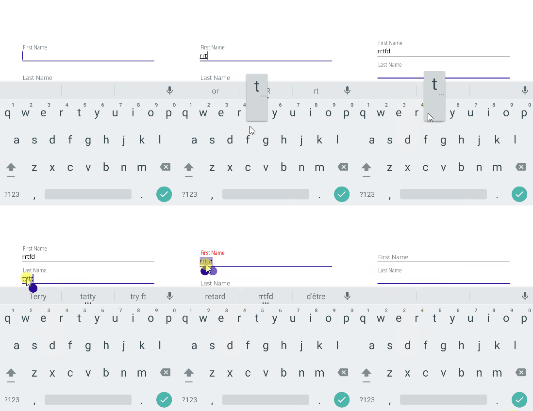
For example, consider that we want to create a custom Entry control that works like the Material entry widget:

This is the usual way we would create it in MauiReactor:

class MudEntryState
{
    public bool Focused { get; set; }

    public bool IsFilled { get; set; }
}

partial class MudEntry : Component<MudEntryState>
{
    MauiControls.Entry _entryRef;
    
    [Prop]
    Action<string>? _textChanged;
    [Prop]
    string _labelText;

    public override VisualNode Render()
     => Grid("Auto", "*",
            Entry(entryRef => _entryRef = entryRef)
                .OnAfterTextChanged(OnTextChanged)
                .VCenter()
                .OnFocused(()=>SetState(s => s.Focused = true))
                .OnUnfocused(()=>SetState(s => s.Focused = false)),

            Label(_labelText)                
                .OnTapped(()=>_entryRef?.Focus())
                .Margin(5,0)
                .HStart()
                .VCenter()
                .TranslationY(State.Focused || State.IsFilled ? -20 : 0)
                .ScaleX(State.Focused || State.IsFilled ? 0.8 : 1.0)
                .AnchorX(0)
                .TextColor(!State.Focused || !State.IsFilled ? Colors.Gray : Colors.Red)
                .WithAnimation(duration: 200),
        )
        .VCenter();    

    private void OnTextChanged(string text)
    {
        SetState(s => s.IsFilled = !string.IsNullOrWhiteSpace(text));
        _textChanged?.Invoke(text);
    }
}

MauiReactor allows you to collapse the component + state in a single declaration that you can return from a function:

In the above example, we set the field name to _labelText instead of the more obvious _label to avoid name collisions with the component Label()

static VisualNode RenderMudEntry(string label, Action<string> textChangedAction)
    => Render<(bool IsFocused, bool IsFilled)>(state =>
    {
        MauiControls.Entry _entryRef = null;

        return new Grid("Auto", "*")
        {
            new Entry(entryRef => _entryRef = entryRef)
                .OnAfterTextChanged(text =>
                {
                    state.Set(s => (s.IsFocused, IsFilled: !string.IsNullOrWhiteSpace(text)));
                    textChangedAction?.Invoke(text);
                })
                .VCenter()
                .OnFocused(()=>state.Set(s => (IsFocused: true, s.IsFilled)))
                .OnUnfocused(()=>state.Set(s => (IsFocused: false, s.IsFilled))),

            new Label(label)
                .OnTapped(() =>_entryRef?.Focus())
                .Margin(5,0)
                .HStart()
                .VCenter()
                .TranslationY(state.Value.IsFocused || state.Value.IsFilled ? -20 : 0)
                .ScaleX(state.Value.IsFocused || state.Value.IsFilled ? 0.8 : 1.0)
                .AnchorX(0)
                .TextColor(!state.Value.IsFocused || !state.Value.IsFilled ? Colors.Gray : Colors.Red)
                .WithAnimation(duration: 200),
        }
        .VCenter();
    });

In Line 2 we use the static method Component.Render() which takes a Func<VisualNode>. It creates a hidden stateful component on the fly and uses the passed function to render its content.

In Line 5 we declare our state using the method UseState<S>() where S is the type of state we need to render the component. You can pass any type to it but, of course, the beauty of the solution is to take everything contained in the function without external references. In the above sample, we use a c# Tuple that has 2 properties IsFocused and IsFilled.

The rest of the function is more or less the same as the content of the Render method.

Inline Components are a perfect choice to render small components that have simple states, you can for example put it in a generic static class that provides general theming functions to the app.